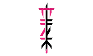

Tattoo Pink is a brand concept I created for a tattoo ink company called PINK. Its logo writes the name in Bosančica, the Cyrillic alphabet of medieval Bosnia, and builds it on the vertical shape of a traditional Bosnian tattoo. The presentation below follows the whole process, from the first shape sketches to the bottle labels.

Concept
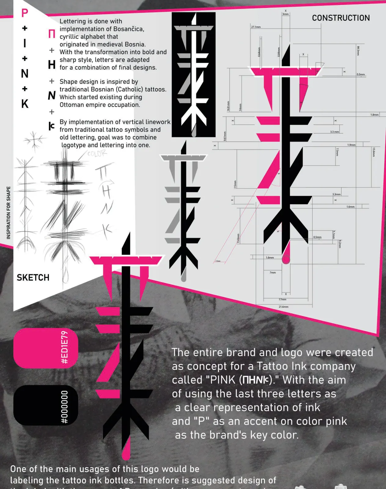
The brand and the logo started from one idea: an ink company whose name already says what it sells. Read PINK and the last three letters spell INK, a clear picture of the product. The P is the accent. It points to pink, the main colour of the whole brand.
Two colours carry it. Pink #ED1E79 is the brand colour, and black #000000 holds the rest of the mark.
Lettering
For the lettering I used Bosančica, a Cyrillic alphabet that originated in medieval Bosnia. I pushed its letters into a bold, sharp style, so each one could be adapted and combined into the final designs. Down the left edge of the sheet, the Latin P, I, N and K stand beside their Bosančica forms.
Shape
The shape is inspired by traditional Bosnian Catholic tattoos, a tradition that started during the Ottoman Empire's occupation. I took the vertical linework of those old tattoo symbols and joined it with the old lettering. The goal was to combine logotype and lettering into one sign.
After the pencil sketches comes the construction drawing, where every bar, angle and gap of the final logo is measured. The letters sit one under another on a single vertical stroke, which ends in a pink drop.
Labels
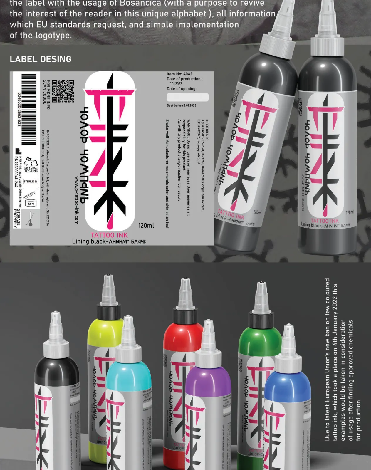
Labelling tattoo ink bottles would be one of the main uses of this logo, so the label got its own design. Bosančica comes back here too, with a purpose: to revive the reader's interest in this unique alphabet. The label carries all the information EU standards request and keeps the logotype simple.
The Lining black mockup lists an item number, production and expiry dates, a field for the opening date, ingredients and a warning. Importer and distributor details and a QR code follow. Symbols mark the ink as sterile, show a 12-month period after opening, ask for proper storage, and state no animal testing. Each ink name is also written in Bosančica.
The coloured bottles come with a note. The European Union's ban on some coloured tattoo inks took effect on 4 January 2022, so these colour examples would only be considered for use once approved chemicals for production are found.
More of my tattoo work, from preparing the machine to the machines I tattoo with, is on my tattoo artist in Rome page.